List Style Tab
Applies to the selected feature when the feature is
not a Document feature.
Specifies how a Feature is displayed in the list view. The list view
is a hierarchy of containers and children; in Google Earth, this is the Places
panel.
Note: The List Item Type may not be
implemented by Google Earth API. You will receive an error message if it is
still not implemented.
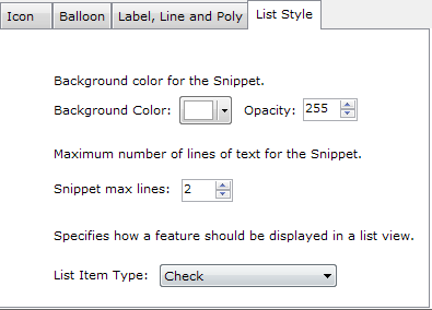
| Background Color: |
Background color and opacity for the Snippet. Opacity of 255 is fully
opaque and 0 is transparent. |
| Snippet Max Lines: |
Maximum number of lines of text for the Snippet. The Snippet is
displayed in Google Earth Places Listview.
Example snippet with 2 lines
viewed in Google Earth: 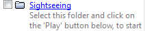 |
| List Item Type: |
Specifies how a Feature is displayed in the list view. Possible values
are:
- Check (default) » The Feature's visibility is
tied to its item's checkbox.
- Check Off Only » When specified for a Container or
Network Link, prevents all items from being made visible at once—that
is, the user can turn everything in the Container or Network Link off
but cannot turn everything on at the same time. This setting is useful
for Containers or Network Links containing large amounts of data.
- Check Hide Children » Use a normal checkbox for
visibility but do not display the Container or Network Link's children
in the list view. A checkbox allows the user to toggle visibility of the
child objects in the viewer.
- Radio Folder » When specified for a Container, only
one of the Container's items is visible at a
time.
|
Copyright © 2009-2011 NorthGates Systems. All rights
reserved.
 Kml Builder
help
Kml Builder
help